Form
Usage of a form
As an admin for a resource you can add a form to it. Once created and saved it will be displayed in the booking window for each user booking your resource.
How to add a form
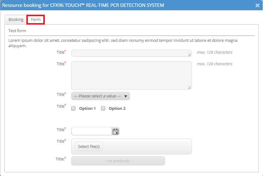
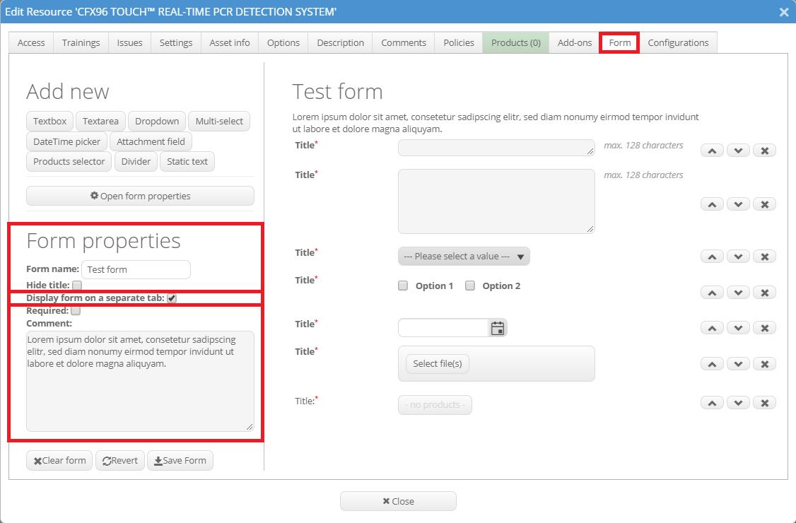
The form can be created in the "Form" tab of the resource settings. It is required to give the form a title but if preferred it can be hidden by ticking the box "Hide title". You can also add a comment which will be displayed as static text below the title. Then you can add several different elements to your form through clicking on the boxes below “Add new”. Clicking the “Open form properties” button will always bring you back to editing the title and comment.
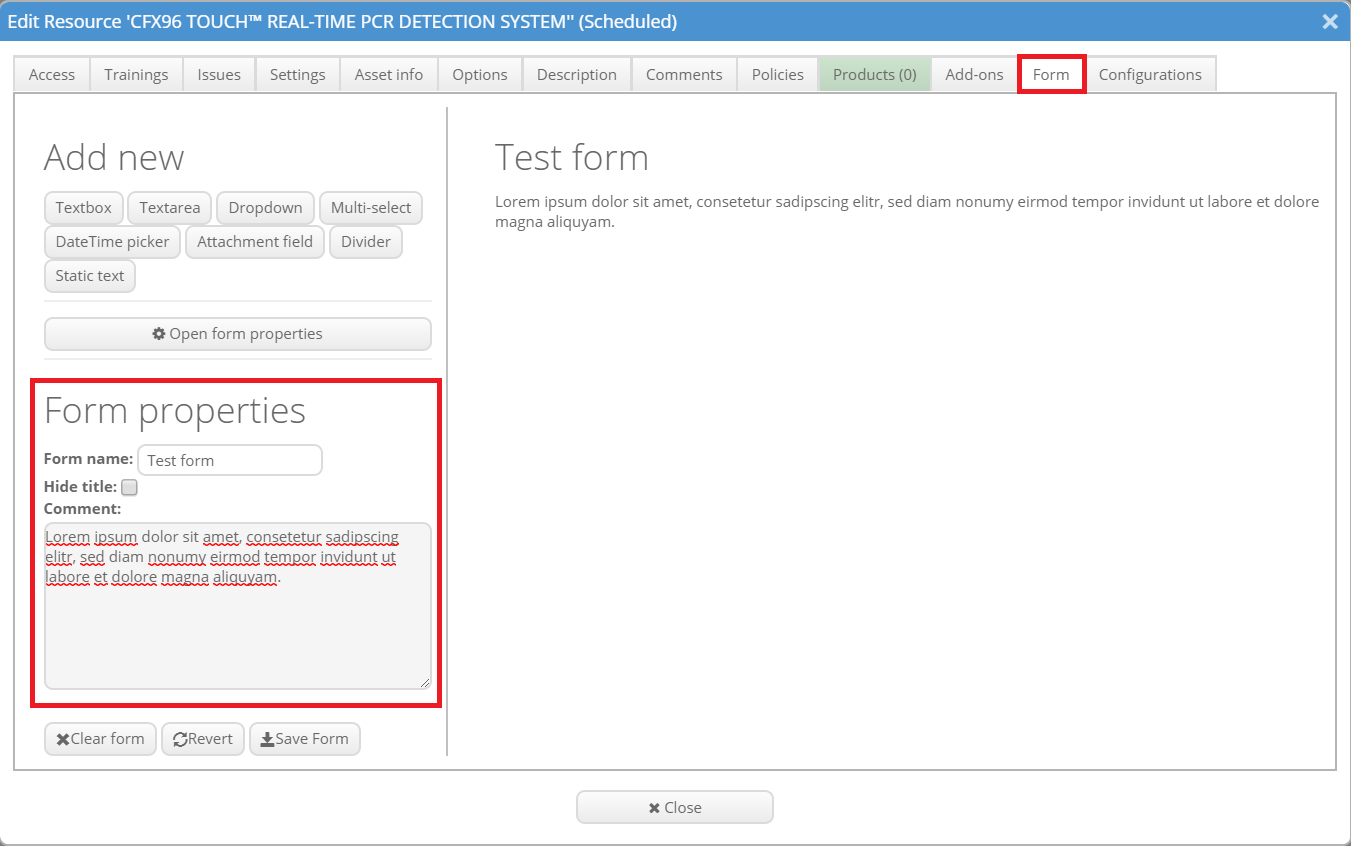
By default every new element will be inserted at the bottom. To change the position use the arrows on the right end of the element. To delete an element click on the X symbol. You can edit each element by clicking on it. Then the element properties will be shown in the lower left corner of the window.
Element: Textbox
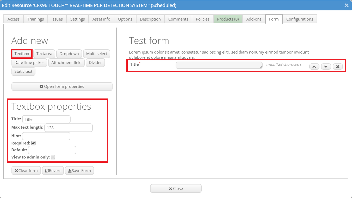
A textbox is a short element where users have to insert text. The title is displayed next to the textbox. The maximum length limits the amount of characters that can be used in the textbox. The hint is a static text displayed below the title in italics (e.g. for important information). If you tick "Required" this field gets marked by a red star and must be filled out. With default you can set a default text that is displayed if the field is not filled out. If you tick "View to admins only" this field can only be seen by admins (please note that the field will then not be seen by normal users and therefore cannot be filled out by them).
Element: Textarea
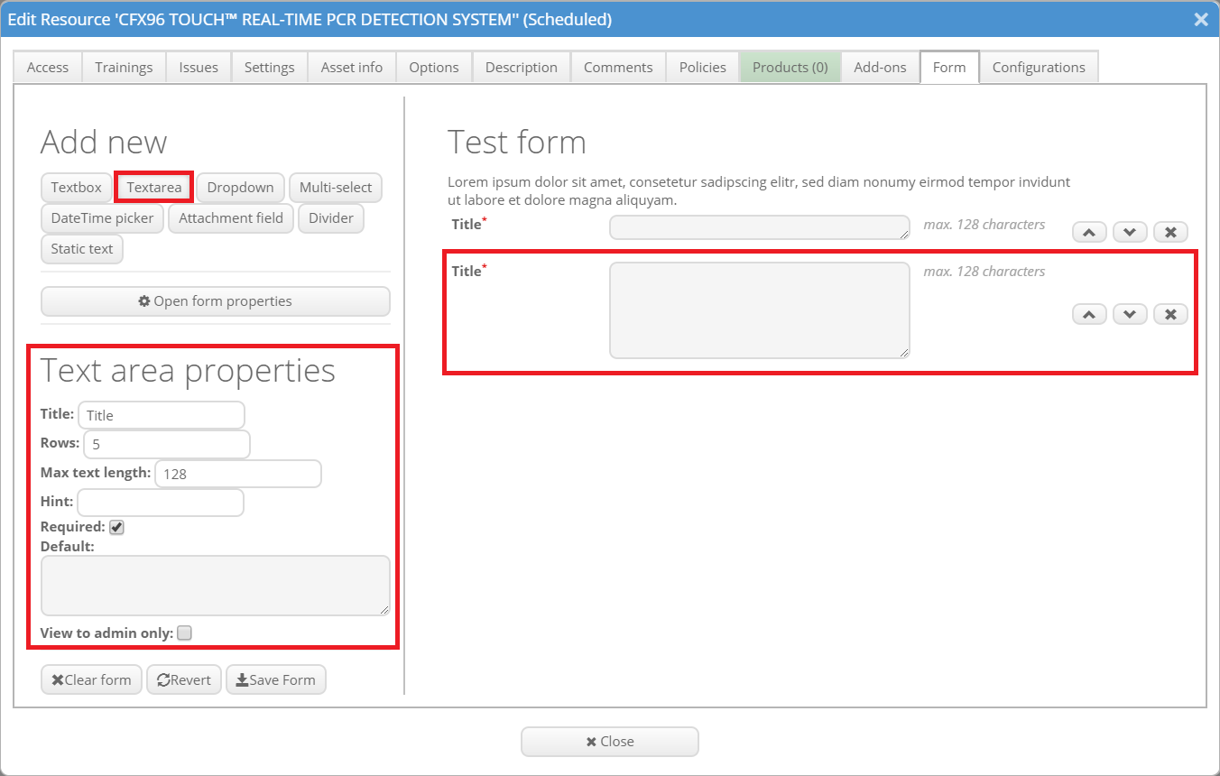
A textarea is a longer element where users have to inset text. The properties are mostly the same as to the properties of the textbox. Additionally you can set the how many rows the user can fill out in the textarea.
Element: Dropdown
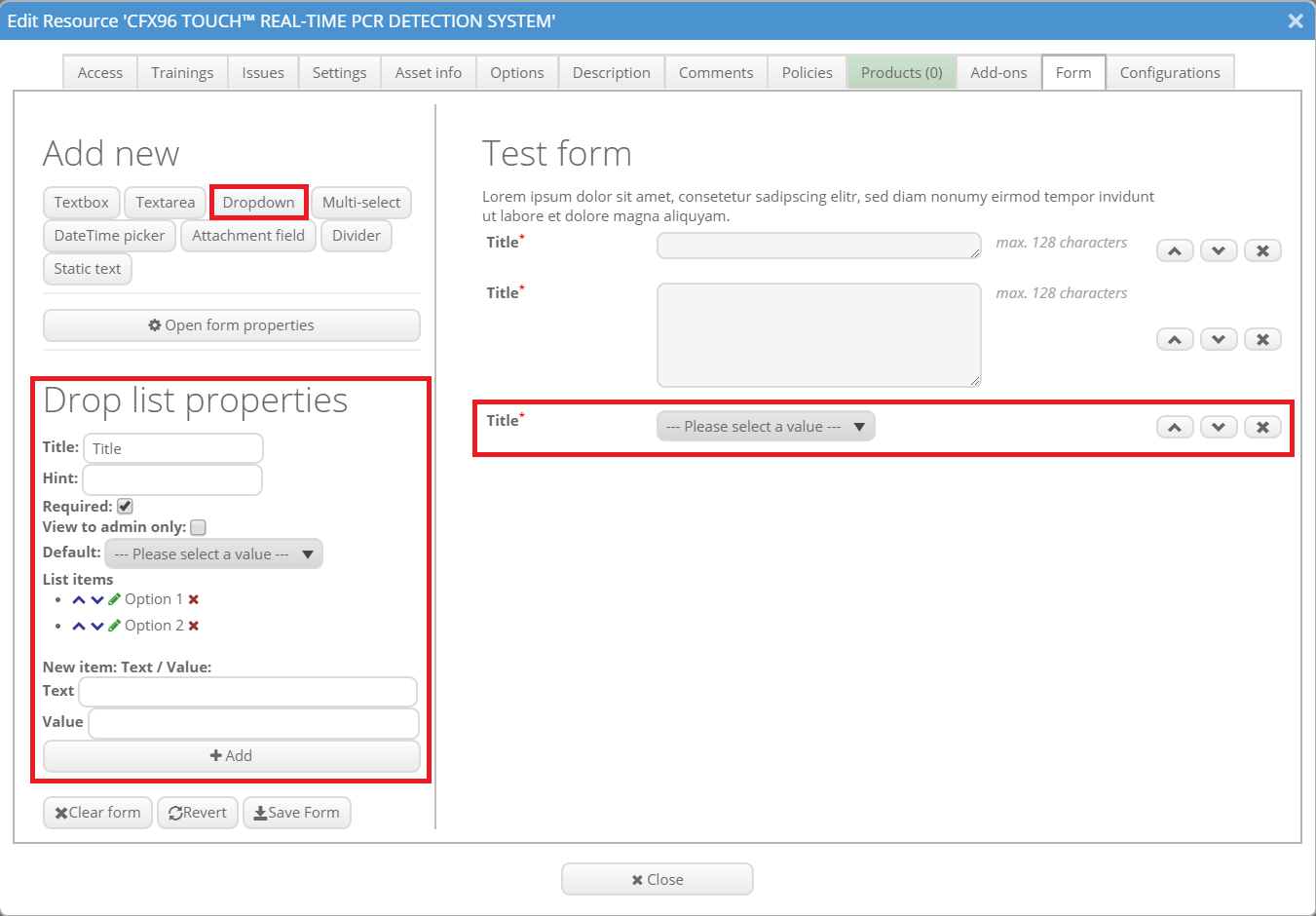
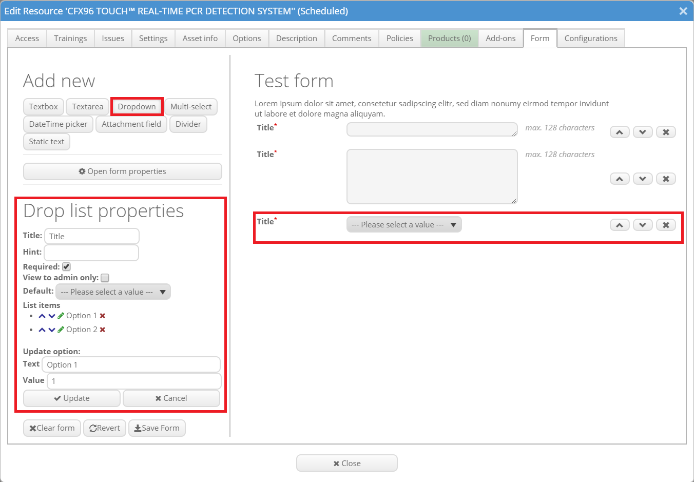
A dropdown menu can contain multiple items of which one can be selected. A new item can be added by clicking on "Add" after filling out "Title" and "Value". The existing items can be edited by clicking on the green pen symbol. Then you can change the title and value. Do not forget to click on "Update" after finishing the editing. The blue arrows change the position of the listed elements, the red X symbol removes them from the drop-down menu.
Element: Multi-select
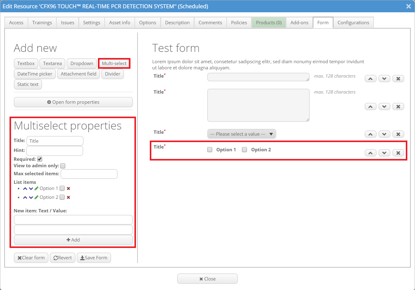
A multi-select gives you multiple possibilities that can be chosen by ticking the boxes. The individual items can be edited the same way as the items of the drop-down menu described above. Additionally it is possible to select how many items can be selected by maximum.
Element: DateTime picker
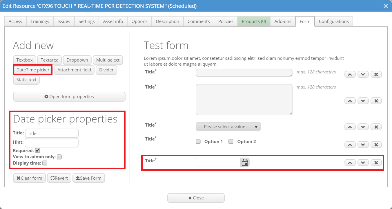
A DateTime picker gives you the option to pick a specific date. If the box "Display time" is ticked, the user can also choose a specific time.
Element: Attachment field
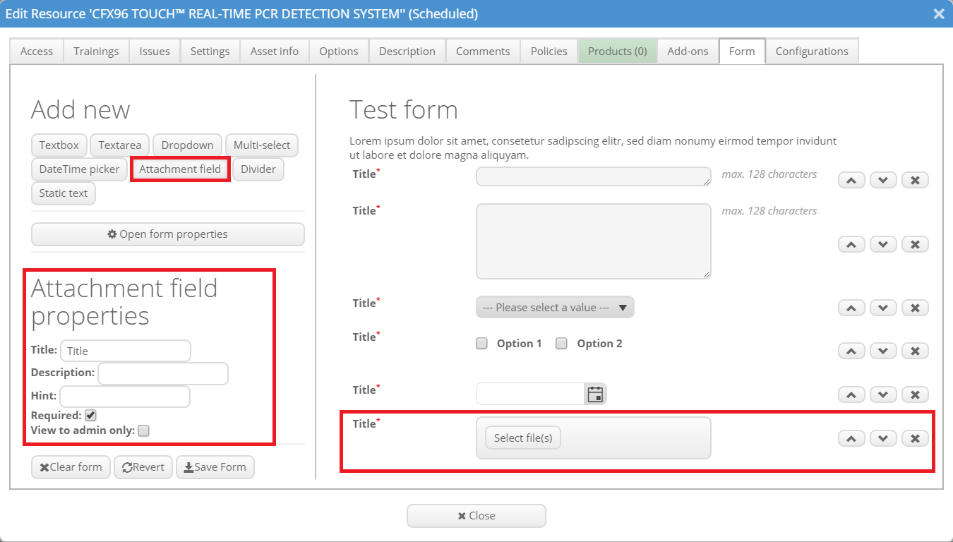
The attachment field allows the users to upload a document into the form.
Element: Product selector
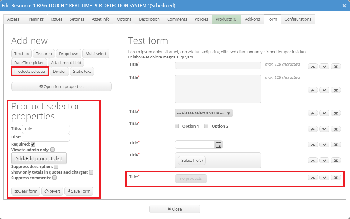
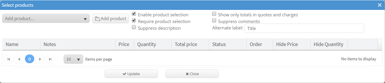
The product selector field allows users to select specific products which the provider offers. The products list can be added or edited by clicking on "Add/Edit product list". Additional features are to "suppress description", "show only totals in quotes and charges" and to "suppress comments".
Element: Divider
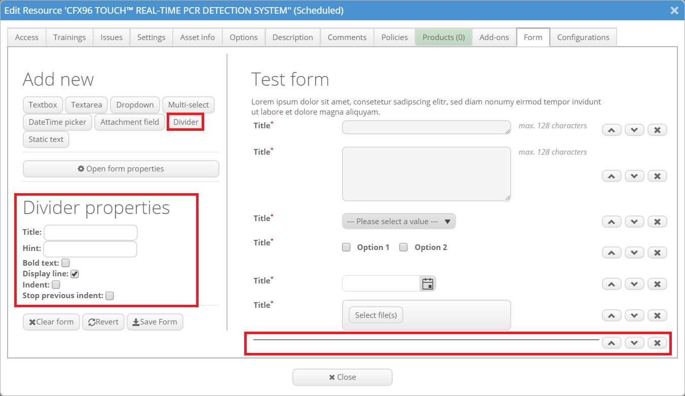
The divider is a horizontal line. It can be used to divide the form in parts and give it more clarity. The divider can be labeled with a title and a hint. It is also possible to indent the content following the divider (tick "Indent") or end the previous indent (tick "Stop previous indent"). If you just need a bit of blank space between the elements it is also possible to not display the line by removing the tick from "Display line".
Element: Static text
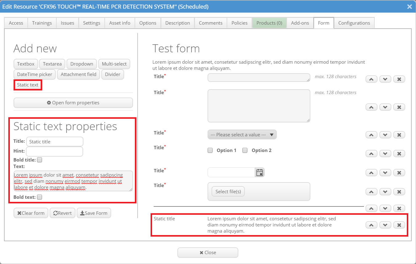
With a static text written by the admin the users are not required to do anything. This element can be used to give the users some important information. The title and/ or the text can be written in bold by ticking the corresponding box.
Element: Number
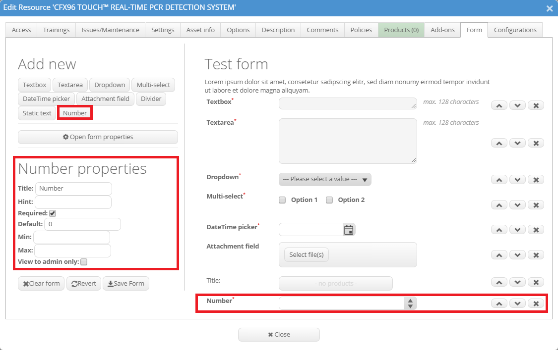
The number field lets the users select a number with an incrementer on the side. The usual parameters can be chosen. Additionally minimum and maximum values can be selected.
After finishing the form please keep in mind to save it if you want to keep the changes (“Save form”). The “Revert” button resets the form to the last saved version. “Clear form” clears all your modules and all inserted text to a new plain form. Please note that by clicking “Close” prior to saving the changes, all new information will be lost.
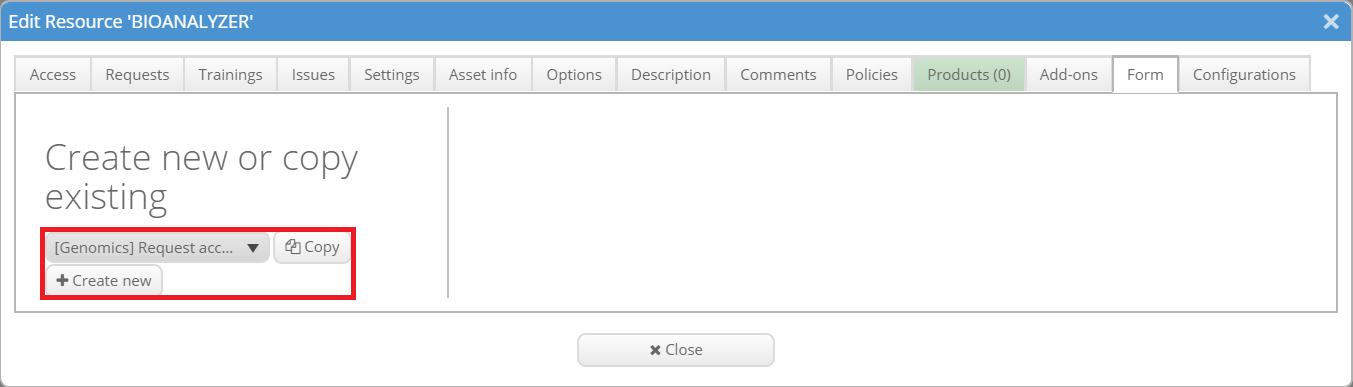
Copy existing form
If you have already created a form and would like to reuse it for another resource you do not need to create it again. When you now open the tab "Form" of the resource settings, you will be asked whether you want to create a new form (click on "Create new") or copy an existing one. If you want to copy an existing form, you need to select the right one from the drop-down menu and click "Copy". Now the form will be loaded but you can still adjust it.
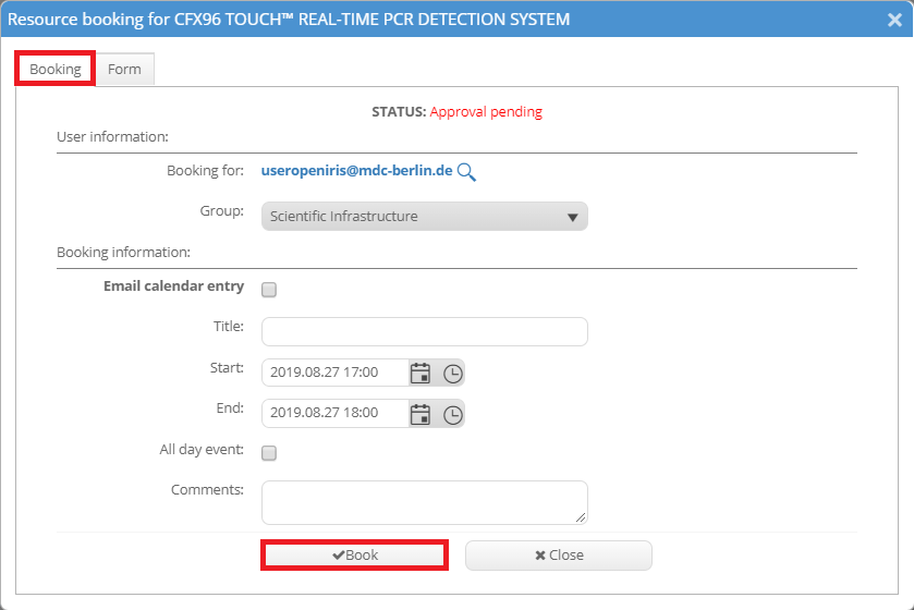
Show form in a separate tab
If your resource has a very long form it may be unhandy to show the whole form below the usual booking window. This is possible in the form properties. In the beginning of this page it is described how to open them. There you can tick "Display form on a separate tab".
Now the booking window will consist of the normal booking tab and an additional tab for the form.